EXIBIT
Constrained identity design, adaptation to strategy changes, and interactions that introduce a new technology.
Published 8/1/2020
Cosmic Inc. is a Toledo-based media startup who created the Cosmic Camera, an orientation-fluid image technology. Artists can shoot once for both portrait and landscape platforms, and viewers can use any screen in any orientation with infinite potential experiences.

How might we arouse the appreciation of fine art, recognize artists, and introduce the Cosmic Camera?
Design the identity system
Design the UI
Design & create the website
I advocated that we design an identity before a product. Using TheFutur's CORE Identity Design Framework, I facilitated a discussion to list our defining attributes.
I then curated visual representations of these with a space exploration theme inspired by the Cosmic Camera name.

Drawing inspiration from the retro look of the 1960's space age, I included elements like worn paper, faded colors, and Ben-Day dots. Spherical compositions, rounded corners, and off-axis tilts demonstrate the Cosmic Camera concept.

Feedback from potential users redirected us. To arouse the appreciation of fine art, the product itself had to be subtle to emphasize content. We also decided to exclusively support iOS and use native components so the identity had to be compatible with UIKit. We refined the attributes and restarted visualization.


With a focus on recognizing artists through transparency, we narrowed in on a final concept inspired by a museum experience with elements like a picture frame, refracting light in glass materials, and a play on perspective.
Caldina by Artegra is simple and restrained enough for a museum theme, yet artistic with it's brush-like strokes and natural curves.
An evaluation of the proof-of-concept using Jakob Nielsen's 10 Usability Heuristics revealed several flaws. After some difficulty solidifying requirements, I advocated for strategy refinement. Early discussions with photographers and consumers revealed critical features and narrowed our focus.
User needs conflicted with business goals. Photographers were likely to capture with a professional camera before publishing, but we wanted them to explore the in-app Cosmic Camera. The product had to feature the new technology while respecting the traditional shooting method. I restructured navigation and designed an album publishing flow to accommodate both.

Using native UI components restricted my creative freedom but allowed me to focus on a few custom components.
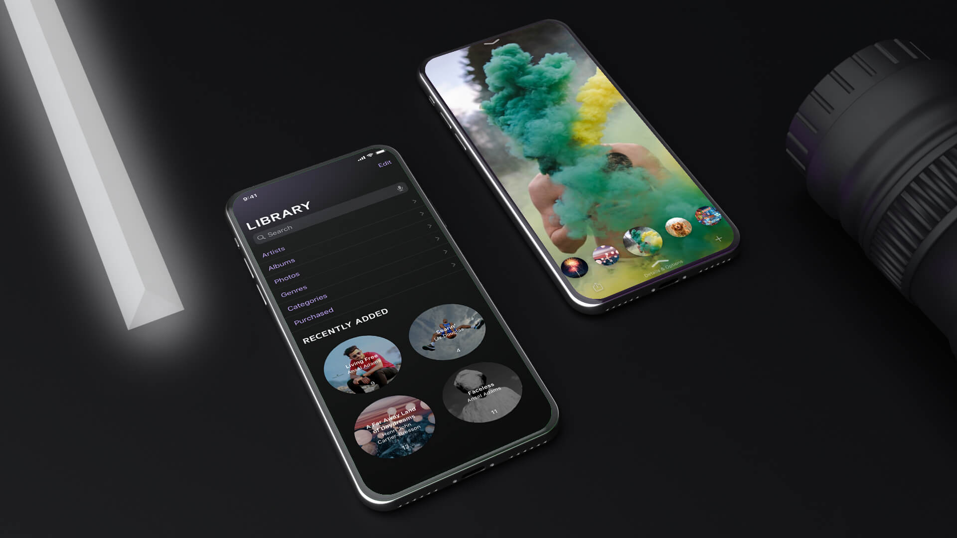
Of primary value was the recognition of artists. Their art should be appreciated to a degree commensurate with the effort required to create it. In a fast-paced world of short attention spans and slivers of time spent on individual works, we encouraged a prolonged engagement. Instead of an addicting stream that tempts endless scrolling without intention, Exibit's feed would encourage voluntary and thoughtful appreciation. Working closely with engineers, we balanced responsiveness with friction and discovered the optimal number of simultaneously available photos.

We drew inspiration from how music is enjoyed. Just like musicians, photographers publish albums. To encourage acknowledgement of a full body of art, viewing photos was synonymous with listening to music. Pronounced progress bars and a persistent now-viewing component remind the user that there's more to experience.

Viewfinder grid lines show how an image will be viewed. The center circle is the safe zone which will be shown regardless of aspect ratio and orientation.

Using a 3-position toggle switch requires users to specify whether or not an album contains explicit content.

The goal of the website was to promote Exibit to viewers, artists, and investors. We followed a basic campaign page format and collaborated to fill it with copy. Once revised, this guided visual design.
The hero would state and visualize the value proposition.

Being more liberal with the identity, I created an engaging way to communicate each benefit.
We made strategy changes on the fly, even in the midst of development. This resulted in inefficiency and a too widely targeted product. I will now ensure a definitive strategy is validated by consultants, stakeholders, and users before moving forward.
I was hesitant to weigh in on decisions when I wasn't confident in my perspective. In hindsight, the opportunities to test my theories were worth the consequences of being wrong. I'll now speak my mind liberally, albeit with skepticism.
The overall culture of our team lacked urgency. We were patient with each other's creative processes and we took our time to make important decisions. Although the experience was comfortable, it was also inefficient. I'll now adhere to a strict timeline to avoid perfectionism and excessive analysis.